What happens to all that Blueprint workshop feedback? Part 1 - 2022
If you’ve attended a workshop to review the Blueprint, have you ever wondered what happens to all the comments you and your colleagues provide? Staff comprehensively sift through every single one! I’m going to do a deep dive on Blueprint feedback and just what we do with all the critically important input we receive during workshops. First, we’re going to jump in a time machine and look back to the 2022 Blueprint update—the first time the Blueprint used consistent methods and indicators across the continental Southeast.
Why do we solicit feedback in the first place?
As a living spatial plan, the Blueprint is always a work in progress. Staff continue to refine the Blueprint to incorporate improvements to the input data and methods, as well as feedback from Blueprint users, subject matter experts, and other partners. Much of that feedback comes during our annual Blueprint workshops. We use that input to guide the most important improvements for that year’s Blueprint and beyond. Anything we can’t fix right away ends up in the list of known issues that accompanies each version of the Blueprint, which serves to transparently document issues for users to be aware of, and to ensure we carry forward a running list of potential improvements into the next update cycle.
How did we analyze feedback in 2022?
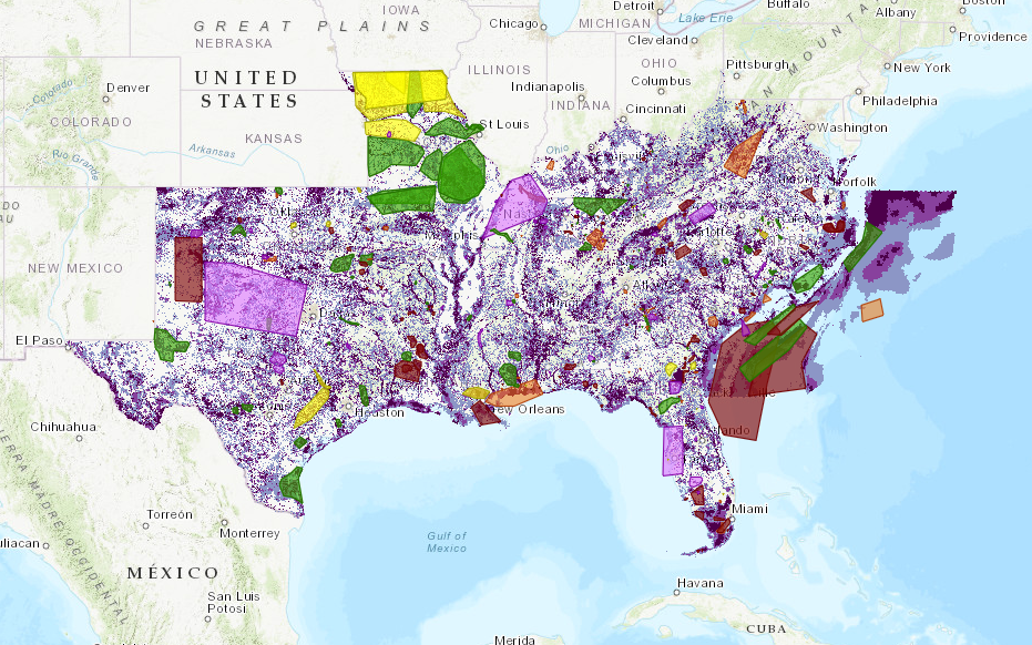
In May of 2022, we hosted sixteen virtual workshops spanning the Southeast, with geographic focal areas ranging from Virginia to Texas to the Blake Plateau in the offshore Atlantic Ocean and the coastal waters off the Florida Keys. As mentioned in Hilary’s blog from May 2022, more than 230 people attended from 80+ organizations. Those 230 people provided a lot of feedback—in fact, they drew 485 spatial feedback polygons in the interactive ArcGIS Online feedback tool!
So how did we manage all that input? I like to think of the approach we used as triage.
Triage: Fix what we can, document what we can’t
First, if there are obvious issues that need to be fixed, the team digs in for improvements. Those improvements are either to existing indicators (in 2022, there were 37 spanning the continental Southeast area) or are creating new indicators might address key gaps. For example, 2022 workshop comments noted that we were missing important habitat for grassland species near known grasslands. Many grassland species, like birds and pollinators, depend on nearby grassland habitats during various parts of their life history. After the workshops, we improved the Interior Southeast grasslands indicator by including buffers around known grasslands based on bumble bee ecology.
In 2022, staff had just over a month to determine how to adjust the indicators to better reflect the feedback we received. This included identifying the issues, modifying or adding indicators, documenting those changes, and rerunning the Blueprint modeling process to make sure the results address the issue without any unintended side effects.
Then, once we fix everything we can in the time allotted, we go through every single comment again to inform our known issues. In 2022, we managed to either fully or partially fix about 40% of them. Any workshop comment we weren’t able to resolve in this phase is captured as a known issue in the documentation.
Binning by Theme
The second phase is where my efforts came in. This is a substantial amount of new information coming in from the Blueprint community—more than 400 comments! To grasp the bigger picture of these comments, it is valuable to be able to relate the comments to one another and see how they fit within the various moving parts of the Blueprint analysis. So for 2022, we took a high-level approach to analyzing each spatial polygon and comment for larger themes.
We accomplished this analysis using two different scopes:
- Part 1: Analyzing all 400+ comments from 2022 workshops, including already fixed comments, correctly prioritized comments, and questions about areas
- Part 2: Analyzing only comments which had not been fixed or only partially fixed in the earlier review process: a total of 142 remaining comments
Binning, Part 1: Analyze it all
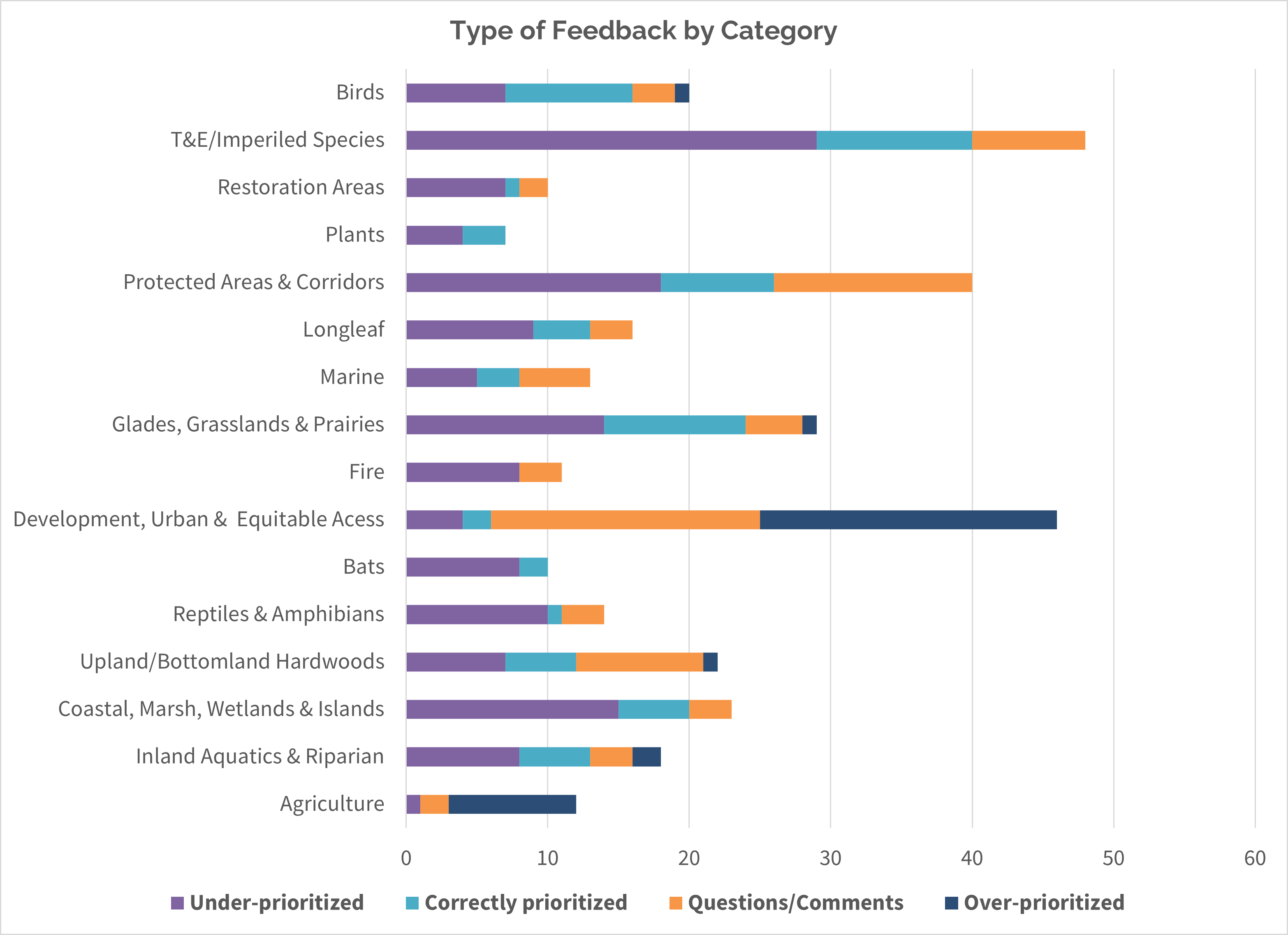
We categorized each comment according to its location, respondent, classification (was the area overprioritized, under-prioritized, or correctly prioritized) and finally its theme. To start the process, we classified the feedback with tags or keywords. For example, was this comment about underrepresentation of important bird areas, or about overprioritized agricultural lands? Then we tagged it “avian” or “agriculture”. Each comment received 1-2 keywords based on the subject(s). Once we had our keywords, we began identifying themes.
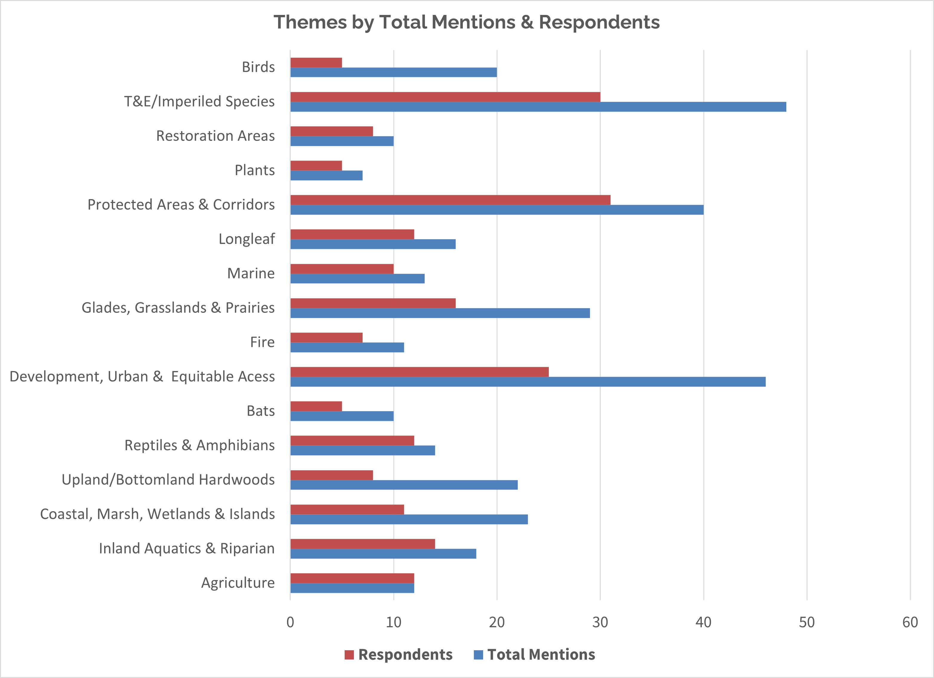
In the end, we grouped the 400+ comments into 16 themes. Within and across theme groupings, we could then tell:
- Is this theme generally over- or under-prioritized in the Blueprint? Or is it generally correct?
- Is this theme spatially represented across the entire Southeast, or one region?
- Overall how popular is this theme across workshops—how many times total was it mentioned?
- Is this theme brought up by numerous participants or a couple of influential commenters?
And here are some of the results:
We also developed a chart tying each theme to the geography in which the feedback polygons were drawn. We found only five of the themes were distributed across the whole Southeast, whereas the remaining themes seemed tied to more of a specific subregion.
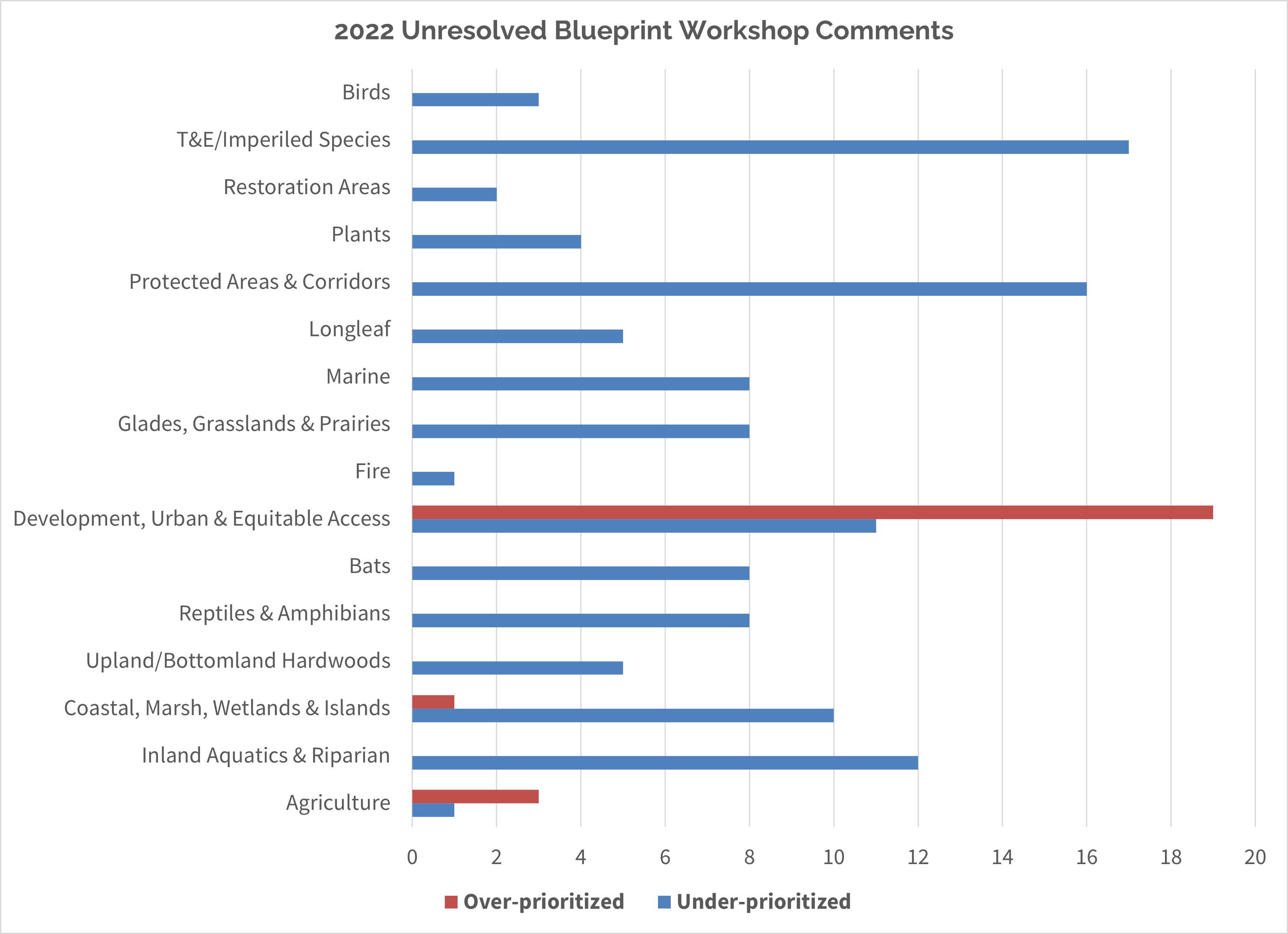
Binning, Part 2: Narrow it down to remaining known issues
We found that exercise to be a useful analysis for all comments, but what about the comments we couldn’t address yet? Here’s what we found was left:
We whittled down the starting 485 comments to a total of 142 areas which had not yet been addressed or were only partially addressed in final Blueprint 2022. As you may remember, each comment counted towards 1-2 keywords/themes depending on the topic. We used the same themes from the previous analysis and created a similar output in the chart below.
How did we apply that feedback in 2022?
So, how do we use these high-level summaries? Well, in the 2023 update and beyond, we used and will continue to use this feedback to guide improvements for existing indicators and the development of new indicators. It’s exactly why we solicit feedback through dozens of workshops: to better represent our users’ expertise on the best places to have a conservation impact in the Southeast. The process definitely required an investment of staff time and brainpower, but was well worth it for the direction and guidance it provided. In 2024, we will be coming back to the continental Southeast, so this analysis will be invaluable for driving improvements in the next revision!
Stay tuned for the next installment, when I’ll talk about how we analyzed feedback for the current Blueprint, version 2023.